Why the Expanded Color Palette
Teal has long been present on SDSUs campus and in its architecture, and its inclusion also reflects the importance the color holds for some within Native and Indigenous communities.

In launching the updated brand strategy during San Diego State University’s 125th anniversary celebration on March 14, new secondary colors were introduced: charcoal, white and teal.
The university’s leading primary colors remain red and black. And following months of research and discussion during the university’s strategic planning process, along with an additional 10-month project involving students, faculty, staff and alumni, SDSU introduced an expanded color palette, providing guidelines for when the three secondary colors may be used.
“You cannot go many places on our campus without seeing the color teal, which is an accent color throughout campus,” said J. Luke Wood, SDSU’s vice president for Student Affairs and Campus Diversity, and co-chair of the strategic plan implementation.
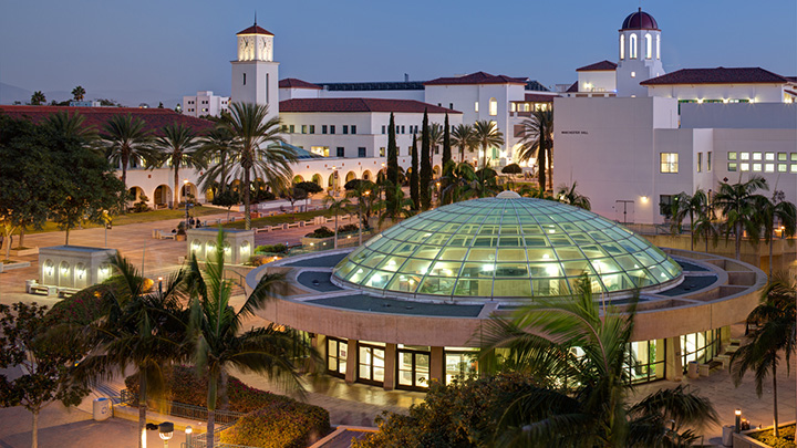
“You will find teal in our most important gathering spaces, including East and West Commons and the Union,” Wood said. “It is in and on our office, academic and research buildings, such as Engineering and Interdisciplinary Sciences and Student Services West. And you will find it on our beloved University Library and some of our residence halls.”
“The color represents the foundation of our campus and community and is visibly connected to the spaces most important to how we connect with one another and also where we study, work and socialize,” he said.
Outreach and Diversity Initiatives Librarian Gloria Rhodes agreed.
“When I reflect on the color teal, it reminds me of the same color on the Library Dome, the home of the university’s academic core,” Rhodes said. “The color for me is a reminder that our library is the center of our campus and also demonstrates our commitment to student growth and success.”
Notably, the teal was introduced for two primary reasons. The color is pervasive throughout the physical environment, including windows, staircases and as accents. The color is also similar to turquoise, which has strong spiritual and cultural meaning for some members of Native and Indigenous communities.
Each year in November since 2014, the SDSU men’s basketball program has worn turquoise jerseys during a home game. The intention of wearing the color is to show solidarity between the university and the Native American communities in San Diego County and is part of a partnership between SDSU and Nike N7. The color itself is deeply symbolic and reflective of both friendship and community.
The university also adopted two other accent colors, charcoal and white; these colors do not supersede the university’s primary red and black colors, but may be used as accents or supporting colors.
“To me, this new brand represents SDSU's relationship to the future. I love the crisp clean lines of the logo and the introduction of a new color to support our traditional red and black,” said Jessica Nare, assistant vice president for Community and Belonging. “We are a thoughtful, mission-focused, and forward-thinking campus. SDSU recognizes our past, while also charting a new path for the future.”
More information about the university’s brand is on Brand Portal, along with a special section dedicated to the university’s colors. Information about the appropriate use of the colors, and other elements, is in the university’s brand guidelines.


